Smith is a small point and click experience based on themes of social isolation, and loss of identity, seen through the lens of a dystopic society obsessed with work, and complete individualism.
Smith was developed as an individual project on the flash-like game engine called “Flickgame”, which only uses color, and alternating between a limited amount of game screens as functioning game mechanics.
The experience is based on contrast, on change, and on reinforcing the sensation of being lost in an infinite loop of nothingness.
You can play Smith right now.
In Smith I took care of:
Game Design:
I designed the main structure of the narrative, and from there, designed how the experience would flow from screen to screen, determining the different outcomes of the player’s decisions, and how to lead him to the different places the plot could go, by using color and contrast.
Art:
I tried to find a style that worked under my limitations as a graphic artist, and went for a simple line, black and white style, that used color in a very limited fashion, in order to highlight it, and lead the player through the different scenarios.
On the use of limitations as tools:
This game was a result of working with a tiny game engine called Flickgame for the first time. In this engine you can create different 2D scenes which the player can only navigate through clicking on the colors that compose the scene. The color palette, pixel size and scenes you can use for a game are very limited, so it was a challenge of knowing how to use the tool's limitations to my advantage.
Scene composition is an essential element when working in this engine, as interacting with colors in a scenario is the main way the player has to interact with the game.
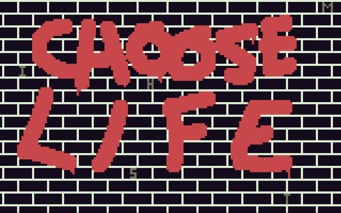
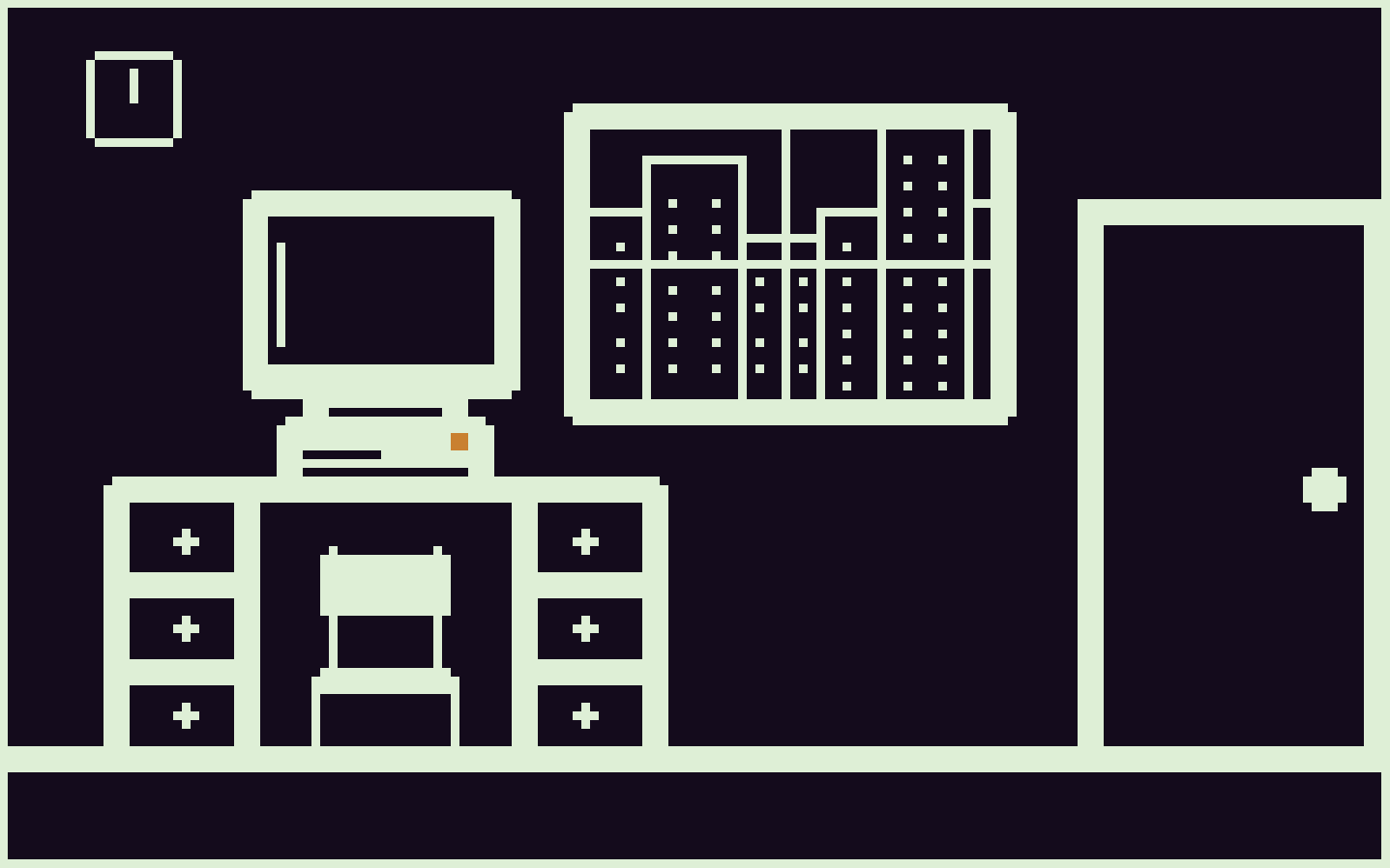
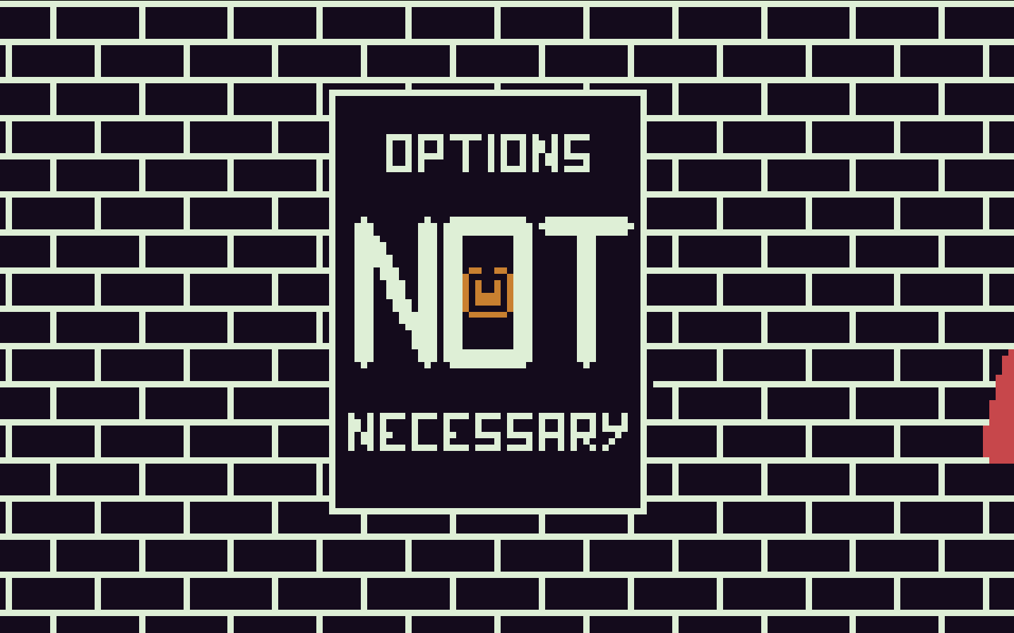
Since there is such a limitation to color and pixel size, I decided to go for a style highlighted by contrast. I wanted to tell a story of choosing your own fate rather than conforming to a path laid out for you, so I used visual elements that represented those two opposing ideas. Most of the scenes have an almost completely monochrome color pallet, with very square-like shapes. These represented the monotonous and oppressive nature of a distopic society in which individuals merely follow their laid-out path.
Then, I used intense colors, mainly red, to highlight the breakout moments where the player can escape the monotonous grey landscapes of the city and search for liberation and a new fate. Using these vivid colors as contrast was also a way of guiding the player to the possible interactions available in a scene.
The only non-monochrome color I used to associate and interact with the oppressive society was a lowly saturated orange, that would only appear with elements closely related with those negative elements. By associating emotions and ideas with colors, I was able to convey meaning by displaying them in different situations. Given that interacting with elements differentiated by color is the base of interaction in this engine, I used color and contrast as a tool to convey meaning through the players' interactions.


